What’s Inside This Case Study
1. Working for Standley(Intro)
Overview of my role at Standley and the scope of this case study.
2. Bringing LeanBag to Life
Early product development, prototyping, user testing, and real-world use.
3. Kickstarter & Launch Strategy
Campaign planning, content creation, visual identity, and storytelling.
4. Expanding the Standley Line
Designing packaging systems, prototyping new products, and growing the brand.
5. Visual Identity
Logo development, colour system, iconography, and scalable branding assets.
6. Reflections
Summary of impact, what I learned, and how the work evolved beyond LeanBag.
Working for Standley
While LeanBag was the flagship product, my role at Standley reached far beyond that single launch.
Working with a small and scrappy team, I led creative direction across every brand venture. This included shaping new product concepts, developing packaging lines, building visual identity systems, guiding launch execution, and creating retail and wholesale assets that supported long-term growth.
From product development, mock-ups, investor decks, and customer-facing materials, my work became the creative through-line behind the Standley brand. I carried projects from concept to campaign.
During the LeanBag launch, we were racing the clock while building the identity, finalizing the prototype, planning the Kickstarter, and directing photoshoots at the same time. It was intense and collaborative, with entirely too many late nights. My title never changed, but the responsibilities certainly did.
Role: Creative Lead
Employed: [2018-2019]
Scope:
- Developed brand identity
– Product design & development
– Kickstarter campaign
– Photography direction
– Packaging & retail materials
– Strategic communication
Security by Design
These integrated pockets offer stealth access and protection in crowds, documented and handed off with production-ready specs.
Worked closely with the industrial design team to iterate on the A-frame mechanism, ensuring it stayed true to the product’s minimalist intent while remaining functional, comfortable and durable enough for everyday use.
From CAD to carry: Early prototypes showing core features in use
Launched. Sat on. Loved
No instructions required
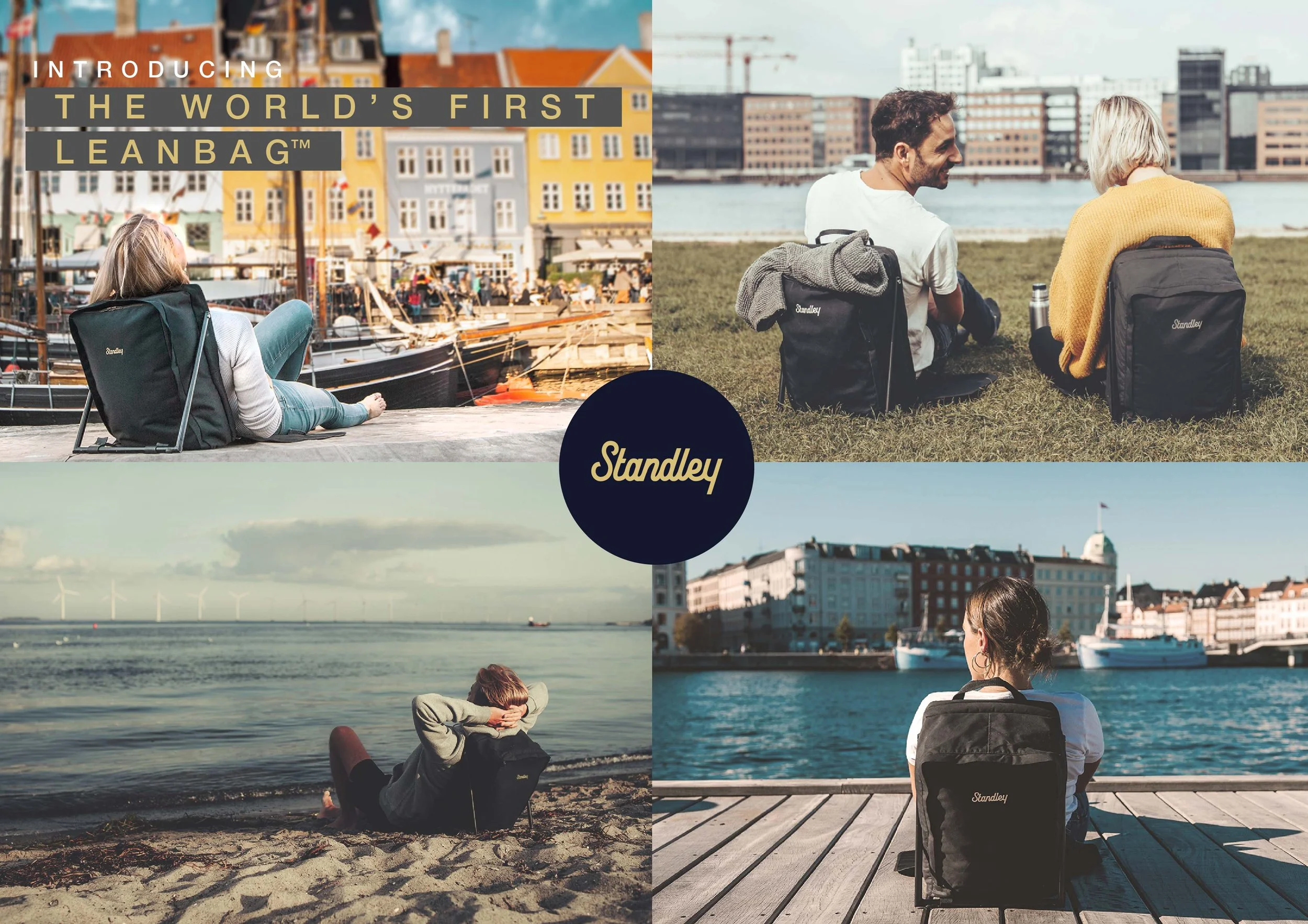
Bringing Leanbag™ to life
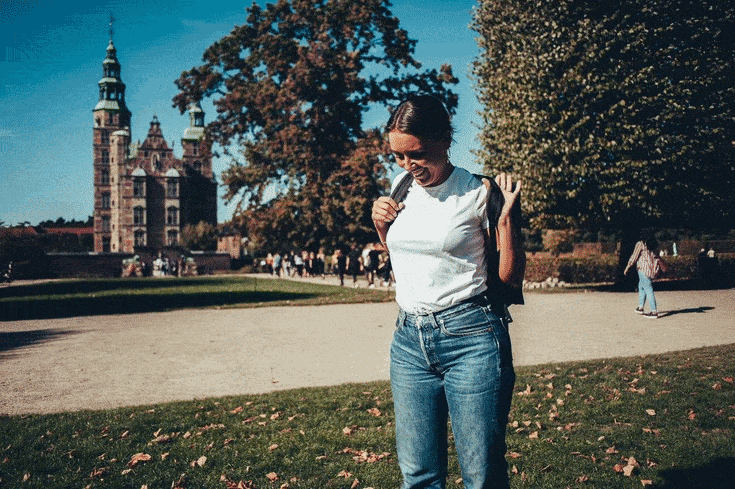
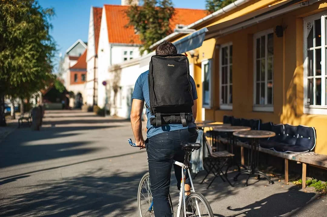
LeanBag was created to solve a basic but relatable problem: how to sit comfortably, anywhere. I wanted the product to feel intuitive and unobtrusive, something you'd grab without thinking. From early user tests to the final shoot, every moment of use shaped how the bag looked, felt, and functioned.
Parts of this journey, including candid user reactions, were documented in our Kickstarter video and helped communicate the concept clearly to backers.


Kickstarter Campaign Video
This video captured the final weeks before launch, from user testing and early feedback to production footage and collaborative problem-solving. It served as the centrepiece of the campaign, communicating not just what LeanBag was, but how it came to life.

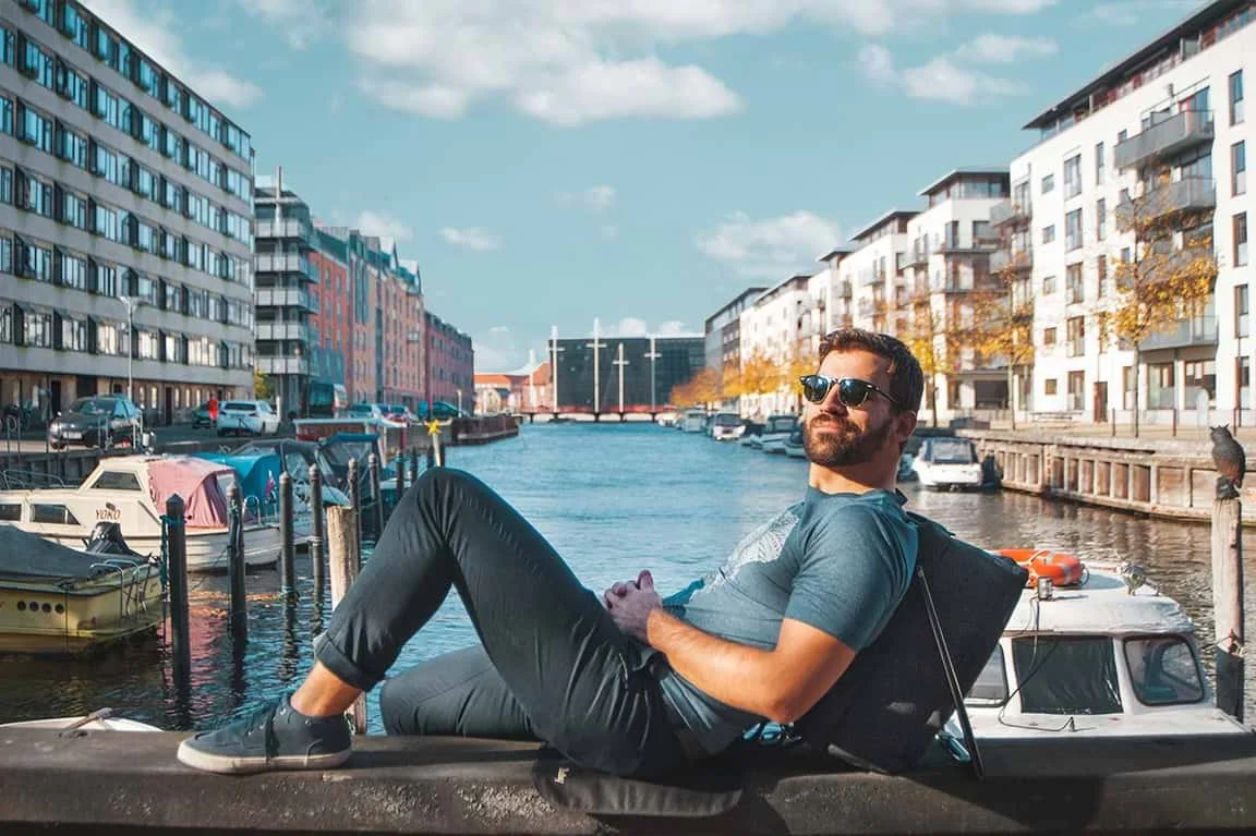
Launching LeanBag™
We launched LeanBag™ on Kickstarter with a fast-paced, design-driven team effort.
At the same time, I directed photography, developed the full visual identity, and prepared every piece of the campaign, from messaging and rewards to page design and strategy.
Some photos were shot with our first prototype, while others came from a second rushed shoot with the improved version, just days before launch.
We only had one color (black) on hand, so I retouched and colour-matched product images to represent the full range promised to backers.
Consultants told us we didn’t have enough time to build momentum.
We exceeded our funding goal anyway.
It wasn’t viral, but it was real. A backed product, launched fast, with a lot of creative heavy lifting and last-minute problem solving behind the scenes
Successfully funded goal of 65.000DKK
Collaborated with the retail and logistics team to define packaging specs, optimise for shelf display, and meet distributor requirements, all while keeping the unboxing experience considered and consistent
Expanding the Standley Line
Standley’s first launch was a guitar stand but as the product line grew, I joined to help refine the brand’s visual presence across packaging and marketing. During that time, I developed a scalable identity system and applied it to a growing range of products.
When LeanBag came into the picture, I stepped into a larger creative direction role, extending the brand into new categories, while continuing to shape its accessories and sub-brands. Highlights include:
Grippad™, Stickpad™, and Stickpicks™
Packaging design, icon systems, and visual storytelling for retail and DTC.GuitarFoot 2.0 Prototypes
Concept drawings, visual prototyping (via 3D printing), and presentation support to help secure early-stage funding.A cohesive visual identity developed in parallel with the product line, applied across dielines, packaging, messaging, and digital assets to bring clarity and consistency to the full Standley range.
Stickpicks™ Retail Packaging
Designed to grab attention, explain the product in seconds, and stay on-brand. The final packaging introduces lifestyle photography to instantly show the product in use, making its function intuitive at a glance, even for first-time customers. This visual context also helped elevate perceived value, making a small accessory feel like part of a broader lifestyle. The front highlights the picks through a transparent blister, while the back keeps it clean with clear messaging, brand consistency, and shelf-ready structure for retail or DTC.
Exploratory Packaging Concepts (Pre-production)
While these early versions explored a minimal, colour-coded system, they lacked the warmth and tactile feel we wanted for retail. The final packaging introduced lifestyle photography and a physical blister to better convey product interaction.
Exploratory Packaging Concepts (Pre-production)
Designed for retail and DTC, this early packaging concept balanced clean, instructional design with lifestyle photography to communicate the product’s function instantly. The dieline features clear iconography, tactile visual cues, and minimal copy, explaining how Grippad™ works while staying consistent with Standley’s brand tone. The design emphasized reusability and ease of use, helping frame Grippad™ as both a smart accessory and a giftable add-on.
GuitarFoot 2.0 Prototype Concept
A folding guitar stand concept designed for quick-use scenarios. I created simplified line drawings and a 3D printed visual prototype to help communicate the idea clearly for funding conversations and early-stage stakeholder buy-in.
Early Looks: Visualising Function Before it Existed.
These photos show an early prototype, with individual parts 3D-printed and assembled to simulate the final product’s intended form and function. While it wasn’t operational, the model served as a compelling visual tool, helping stakeholders understand the concept and opening the door to further development funding.
Visual Identity: Simple, Scandinavian, Scalable
When I joined Standley, there wasn’t yet a brand, just a product and a name.
I developed the visual identity alongside the LeanBag launch: wordmark, colour palette, typography, photography direction, and packaging treatments.
The system needed to feel clean, confident, and versatile, equally at home on festival gear, retail shelves, or Kickstarter pages. Everything created for LeanBag was designed to nest within a broader, scalable brand system, one that could grow with Standley’s evolving product line.
As the brand took shape, I explored several identity directions, including early naming and logo concepts for The Copenhagen Bag. These iterations helped establish a visual tone that was structured yet relaxed, grounded in Scandinavian design cues with room to flex across sub-brands and new product ideas.
Subsection: Logo Explorations
Early branding variations explored for “The Copenhagen Bag” helped shape the final Standley direction.
Wordmark & Typography
A customised wordmark became the cornerstone of the identity, supported by a clean, legible sans-serif typeface for product and communication design.

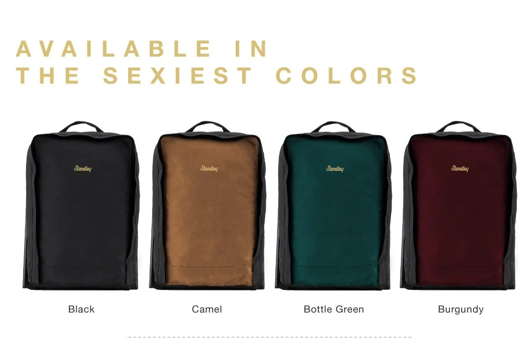
Colour System
The palette blends deep utilitarian tones with warm, retail-friendly accents — versatile enough for outdoor gear, accessories, and digital touchpoints.

Retail Collateral & Consistency
Beyond packaging, the identity needed to scale into retail and wholesale assets. I designed line sheets like this one to present the product range clearly to buyers, reinforcing the brand’s cohesive and elevated look.
Closing Reflections
What began as a small freelance brief, turned into one of the most creatively demanding and rewarding projects I’ve taken on. From early packaging and brand development to leading the creative rollout of LeanBag, my role at Standley evolved with the company itself. I worked across physical product design, digital storytelling, retail strategy, and identity systems, often under fast-moving deadlines and tight resources.
While not everything made it to market, the process sharpened my ability to work cross-functionally, make fast, informed decisions, and bring form and clarity to ambitious ideas.